For the final project of the year, the Studio 1 students researched contemporary Asian artists. Each student chose an artist to study and created an artwork in the conceptual and/or visual style of that artist.
Anjuri K, Grade 11
Inspired by Kazuo Oga (Japan)
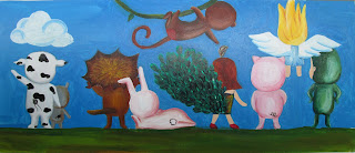
Kazuo Oga inspired me in different ways, but the first time
he inspired me was when I first watched My Neighborhood Totoro at the
age of six. One reason that I was inspired by him at that age was because I was
too young to know other art works from other famous artists. Even though Kazuo
Oga is not that famous in the world, I was still inspired by him for his
imaginative drawings. He made up this
creature, Totoro, in his work, so in one of my works I drew the creature that
looks like a frog but has legs and hair. In the other drawing I drew a cat
because he often draws cats in his works. I used watercolor because his works
are almost all done in water color. Moreover, I think water color gives a
warmer atmosphere than other materials like how all of his drawings. Both of my
works are located at the river because his works are usually more focused at
the river than the city. If I had time I could have tried drawing city with
more details.
Ein J, Grade 11
Inspired by Mari Kim (Korea)
Mari Kim’s emphasis on the eyes of her illustration has
inspired me to follow her style. Kim’s “eyedolls” specifically enlarge the eyes
and head to create her own unique kind of characters. My paintings follow her
footsteps of highlighting and stylizing eyes.
My big piece, “See Me,” describes
my beliefs about humans as well as my artistic style. Through enlarging the
ornate eyes, I conveyed my own taste for big, detailed art works. The intricate
designs of the iris mirror the complexity of humans and the belief of eyes
being the windows to one’s soul. My other piece, “Contemporary Tradition” describes
my Korean ethnic traditions and Mari Kim’s character style. Through mixing
tradition with contemporary style, my own personality- conservative but willing
to try new things- is illustrated.
Inspired by Korean contemporary
artist Mari Kim, my two pieces of art reflect my individual beliefs and style.
Yerang L, Grade 11
Inspired by Liu Bolin (China)
My artwork, ‘Rough Reality’ is an installation art placed in front
of the door. Inspired from Liu Bolin, a Chinese artist who is well known for
his series of performance art, ‘Hiding in the city’, I decided to draw a
painting which has realistic background and melts into the environment.
Although its form of art is painting specifically, it has a reason to be called
as installation art, because it becomes a complete artwork with a meaning only
when it is located at the right place. The characteristic of my artwork is that
it is plain. I did not add any specific kind of ornament or stylish symbol, but
tried to depict the scene behind the piece as realistic as possible. However,
because of the different nature of material, it is noticeable that the piece
and the background have something uncommon.
It is really weird to have a painting that is barely noticeable
and nothing interesting except it matches with the background. Nevertheless,
what I intended from this artwork is, to describe the nature of a person who
tries to be a part of society but fails to be the one in every part and forms
his own reality. I wish I could make more of this kind painting, so that it
becomes a series that is more interesting and clear in its meaning.
Nina KM, Grade 11
Inspired by Nguyen Thanh Binh (Vietnam)
Nguyen Thanh
Binh has inspired me with his ballerina paintings. I would describe his art
style as simple, with no details and a little abstract. He mostly uses basic
and calm colors, like shades of light brown or beige. That inspired me to do
three paintings of ballerinas using only two colors, black and white.
Ballerinas’ faces are abstract like on Binh’s paintings. One huge difference
between my paintings and his is that I have used contrast through dark black
shadows and white ballerinas. This contrast also brings a sense of fear and
battle between black and white, since I thought that even though ballet is
associated with beauty, it is still hard and competitive and sometimes even
dangerous.I decided to do ballerinas because Russia is very well known
for its ballet, and since Binh portrayed Vietnamese culture in his art work, I
decided to use some elements of Russian culture in my project as well.
Nivedita D, Grade 11
Inspired by Sohan Jakhar (India)
I looked at Sohan Jakhar’s art and tried to work with his
style and ideas. He likes to paint what he sees around a market place with bold
Indian patterns and has that as the back ground, with a picture of a person or
thing on top. It looks like he painted the image, but it might be digitally
produced in the end. I tried to do exactly what he does, with the patterns and
came up with a bright bold pattern, except I didn’t add the picture on top. I
didn’t quite know how I would scan the canvas and then digitally add the
picture onto it, and neither did I know how to paint the images on and make
them look realistic enough, so I stuck to just the patterns. The painting
didn’t turn out as what I had expected, which was something much nicer and
cleaner in my head. My shapes aren’t all the same and I missed some of the
lines. I did use a lot of colour though. I think it’s like Jakhar’s work, but
with soberer colours and without the image.
Pia T, Grade 11
Inspired by MF Hussain
For my painting I took inspiration from MF Hussain. In his
paintings the main theme is Indian culture. He paints about animals and
sceneries. He also uses very lively colors. So, for my painting of Radha and
Krishan, I wanted something similar. I usually make paintings about Indian Gods
and I wanted to do the same for this one. I took inspiration from Hussains
style. He sticks to the original color of things and apart from that he uses a
lot of strokes and blending. I tried to incorporate that into my painting and
also wanted to add texture. That’s why I used the chalk powder paste to give
the painting a matt look.
Mansi K, Grade 11
Inspired by Sodhon (Tibet)
My work was inspired by a Tibetan artist, Sodhon. His works
consist of really bright colors and he incorporates the different shades of the
colors in his pieces. Sodhon represents Tibetan mythology in his works. The
background of his work stands out and compliments his subject. I really loved
Sodhon’s incorporation of really bright colors and their shades, hence I
decided to do a really bright background with multiple shades of colors that
ranged from white to pink. This made the background stand out and compliment my
subject like the background does in Sodhon’s work. I choose my subject to be
the Buddha’s face as it fits perfectly with the theme that Sodhon represents in
his work. The color choice and the theme were the two things that I really
enjoyed from Sodhon’s works and hence I choose to replicate those in my work.
Subin K, Grade 11
Inspired by Yoshitomo Nara (Japan)
My inspiration was Yoshitomo Nara. I took his trademark,
which are wide eyed children and animals, and put them together by making small
children wearing animal suits. I followed the childlike simplicity and
innocence of his artwork by using colorful paints and drawing simple
characters. I also used acrylic because he uses acrylic paint the most. In
order to not copy his artwork and style I made the eyes simple lines, instead
of wide piercing eyes.
Jonathan K, Grade 11
Inspired by Yayoi Kusama (Japan) and Tenzing Rigdol (Tibet)
My artwork was based off
two artists, the first artist and the base of my artwork was from the Japanese
artist Yayoi Kusama. The polka dots in the background are based off of her
work. The design in the foreground is based off is a graffiti artist called
retna, but the inspiration of such boldness was taken from a Tibetan artist
called Tenzing Rigdol. This is how my piece of contemporary art came about.
Jesal P, Grade 11
In class we were asked to research a few contemporary
artists of our choice and then pick one and create artwork influenced by the
artist's style. I researched several great artists, but ended up choosing a
completely different artist. One night, I was sitting and looking up paintings
and sculptures and all sorts of artworks on google, and then I stumbled upon
art installations. I found them very interesting and thus researched about them
further in depth. After hours of looking at art installations, I narrowed my
search down to 'art installations using lights' and I found the Infinity Room
by Yayoi Kusama and the moment I saw it I knew I wanted to do something along
the lines of that. I saw it at first and thought it would be impossible to do
with the limited resources that we have, but then I remembered Ms Onkka telling
us how for this project sky was the limit, and so I managed to convince myself
that it was possible to create something like the Infinity Room.
I discussed my idea with friends and they all loved it
but most thought it was unachievable, and then Navika came along and gave me
some more input and then we somehow decided to work together to create what we
had in mind.
With a lot of struggle, which includes taking away all
the mirrors from high school and getting yelled at by everybody for weeks, we
finally managed to finish our project. It did not look anything like the
Infinity Room by Kusama, but with the supplies we had, we were close enough.
Navika S, Grade 11
Inspired by Yoko Ono and Yayoi Kusama (Japan)
My artwork was inspired by Yoko Ono and Yayoi Kusama. The mirror room at the end of the installation was based on Kusama’s work with LED lights, mirrors and water, and was slightly different mostly because we could not buy full length mirrors. The passage leading to the mirror room was partially inspired by Yoko Ono’s interactive style (especially the wish pot). The rest was based more on how old items could be used in new ways, and how students should get a fresh perspective on things. The idea evolved from the concept that Woodstock students do not get enough time to think creatively – they always seem to work on the same ideas and the same problems. I wanted to make do an installation rather than a painting because of this reason, I was tired of painting over and over and over. This concept evolved into Jesal’s and my renovation of the storage room.
Amber K, Grade 11
Inspired by Yayoi Kusama
My optical illusion was based on the Asian artist Yayoi
Kusama. I was inspired by here unique and weird style, full of patterns, colors
and repetition. Initially my project was going to be based on polka dots since
that are Yayoi Kusama’s signature piece of work, however in order to add some
of my own tastes to my project I decided to work with lines. However I was
still not satisfied, I wanted to create something big and impacting, so I then
moved on to the simple yet bold color scheme of black and white. I pondered
over whether I should do simple black and white stripes or should I create a
huge barcode? Finally my project came far away from Yayoi Kusama’s piece of
work and created an optical illusion.
As a result
my project was not something Yayoi Kusama has actually made. However my project
is related to her style of art because my project is based on repetition and
pattern which is exactly what Yayoi Kusama bases her work on. I ended up being
inspired by Yayoi Kusama’s style and theme, went far off from her work and
created work based on the concept or repeating patterns.
Tushen N, Grade 11
Inspired by MF Hussain
I
like his style and his inspirations. I like his artwork specially their theme.
I went over his artwork online and it inspired me. That is why I used his
inspiration. He got his inspirations from Ramayna, Mahabharta etc. He also made
artwork based on the time when India was ruled by the British. I chose that
inspiration of his. My artwork is also based on the time when British ruled
over India, the unfair actions they did to Indians. My artwork shows a british
soldier riding a horse, a saint (sadhu) is tied to the Britishers horse and
being dragged. It also shows three Indians of different religion with swords
blocking the Britishers way. It kind of conveys unity of different religion in
India during that time and also the unfair actions of the Britishers to
Indians.


